This week BUGB launched their new-look website. Gone is the intense green and instead we have gentle shades of blue. And a new logo, about which I have to confess I am not sure. I 'get' it, and it does, as claimed, have all the elements of the old logo, but I'm not sure I like it. Undoubtedly it is 'cleaner' and more 'contemporary' but I can't help feeling the attempts to keep the 'old' symbols of cross, water and fish have resulted in something a bit contrived. See what you think:
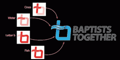
The site is easy to navigate and I was quite taken with the use of an external resource for the 'what is a christian' section, which is not dogmatic or narrow and does not exalt any one understanding over any other on 'hot topics'. Of course there is also a section that explains more about what Baptists (Anglo-Cymraeg variety) are like.
I like the new site a lot more than like the new logo! As rebrands go, this one seems positive - a softer, less clinical feel, easy navigation and not too defensive. Having recently done some user testing for another website that was being relaunched, I have the teeniest inkling of just how complicated it is to design something that works on diverse platforms with varied browsers. I think there is some tiny glitchette with Windows 7 and Firefox as each time the page loads I get a black rectangle top left for a few seconds, but overall it seems to working very well. Huge thanks to all who worked so hard to design, test and launch the site, which I look forward to using for a long time to come.
You can have a look at the website here