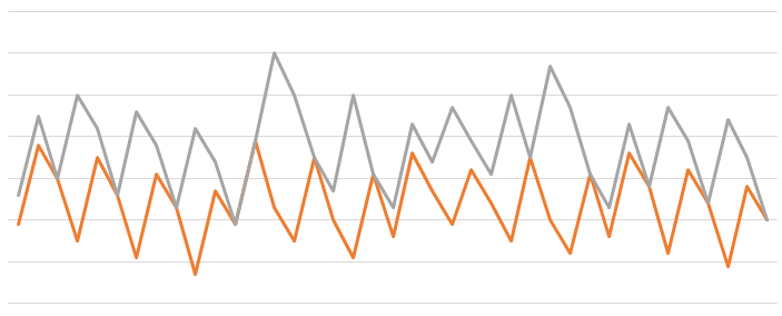
I just spent ages wrestling Excel into submission to generate this variant on a chart I shared around two years ago. Can you tell what it is?
- not a drawing of Sophie's teeth
- not two shockable cardiac rhythms on one chart
- so what is it? And, since I've removed the units, for bonus points, what do you think is the maximum difference between pairs of data points in the two graphs?!
